-
Architects: 7Hoor Architecture Studio, SBAD office
- Area: 2600 m²
- Year: 2019
-
Photographs:Parham Taghioff
-
Manufacturers: FUJITEC Elevators, Fad lighting industry, LG Inventors, Venus glass, Vitra
-
Lead Architects: Babak Khabaz ,Babak Gholizadeh

Text description provided by the architects. Tehran is growing through the transformation of small family houses to apartment buildings, destroying the city view and resulting in limited depth of view in new buildings. Modern buildings in Tehran are usually the same shapes covered with different envelopes. In this project, we tried to break normal boundaries of construction and incorporate architectural strategies responsive to its surroundings to create more interactive life-style by focusing on environmental factors like light, view and topography.

SABA building stands out in its surrounding as it creates urban platform for users to interact and due to its visual appeal. SABA is a nine-story office building located in north of Tehran, Iran. Organic urban tissue of the neighborhood along with development of high-rise buildings has destroyed the city view, resulting in limited depth of view in normal buildings.

In this project, which is limited by a high building in the north and a narrow dead-end street and two story buildings in the south, we aimed for maximum view for our users. To reach this goal, we expand our building along the southern street. Proportions of the site helped us in designing the building in two blocks on the sides and using the middle area for circulations. Staircase and elevation are the vertical circulation and suspended bridges to connect two blocks are the horizontal circulations.

The open area, which is located between two blocks at ground floor, also use as a public deck and expected to help increasing urban depth of view and give users the opportunity to interact. Different approaches where applied to two blocks to adapt various needs of users. This dual characteristic of the project is displayed in its façade;

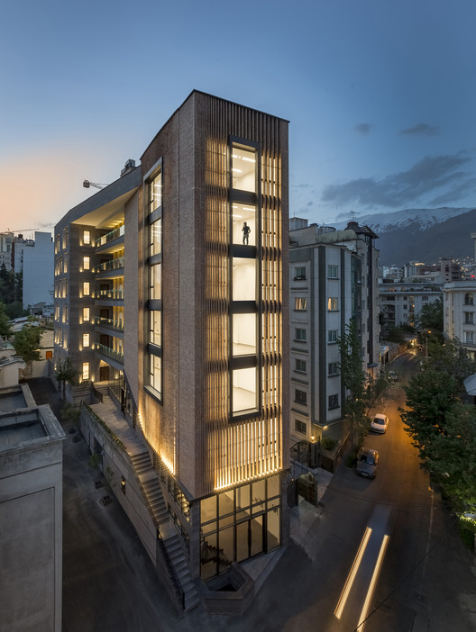
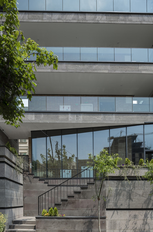
The western façade has a rigid form with more limited openings. In case of material, we used neutral color and a rough texture stone for this block. Eastern block on the other hand, design with maximum transparency, as it is the connection of our project to the city and pedestrians can see it from adjacent street. Moreover, we design a café-restaurant as a public space at the street level of this connection.

This block is also rotated to open the view of the city to our project. We also added a second brick shell to control sun radiation in our office units. We chose brick as a local material and used in a modern style, as a warm color for more attraction. The arrangement of brick columns is a respond to urban openings around the site. Wherever there is an appropriate view, brick columns distance each other and frame the attractive view.

We experienced different ways to install the brick columns and tried to find the best distance and rotation angle to achieve the useful natural lighting for interior and appropriate view from inside. We also used naked glass curtain wall as a movement to show a guideline to the main entrance and maximum transparency for store and lobby area to show how open is the project to the city.


